Introduction
👉 Read this article on the Enhanced Lightning UI
👉 Check out our new design system page
The Lightning Design Systems team and I delivered the Enhanced Lightning UI (ELUI), a three-year initiative evolving from a visionary concept to implementation, featuring an accessible, scalable design system framework and customizable coding language developed in collaboration with teams across Salesforce, and released with a comprehensive Figma kit that empowered designers while earning praise for its robustness and flexibility.
Problem Space: Why Salesforce Needed a UI & Design System Overhaul
🚀 Outdated UI & Inconsistent Branding
- Salesforce’s last UI refresh was in 2015, while half of SHAMSS competitors updated their UI in the past 3 years.
- The outdated look and feel made Salesforce products visibly outdated, impacting perception and user trust.
- Limited branding capabilities led to frustration among our 150,000+ enterprise customers, reducing brand differentiation.
💰 Lost Revenue & Competitive Disadvantage
- Salesforce lost over $7M in ACV due to challenges in building custom, accessible components.
- Companies struggled with Salesforce’s rigid UI, leading to missed deals as customers opted for more flexible alternatives.
⚠️ Accessibility & Compliance Gaps
- The older Lightning UI did not fully meet WCAG 2.1 standards, affecting legibility, contrast, and usability.
- Compliance gaps posed a risk for enterprise customers, especially in regulated industries.
🔗 System Inefficiencies & Designer Pain Points
- Internal design libraries were inefficient, causing teams to detach components and miss critical updates.
- This led to inconsistent UI across 300+ designers & hundreds of engineers across different clouds, making it harder to maintain a unified experience.
- Teams spent excessive time recreating components instead of leveraging a scalable, centralized system
.
Sooo TLDR... a lot of reasons 🙃
Discovery: Reimagining Salesforce
During the North Star phase, we hosted an internal design jam with 100+ participants across Salesforce. With 30 contributing designers, we generated 140+ blue-sky concepts, envisioning the future of Salesforce based on real customer feedback.

From this, we identified key themes:
- Reimagined navigation for better wayfinding
- More whitespace for a cleaner, modern look
- Bolder, vibrant colors to enhance brand identity

Our Principles: A Foundation for the Future
To guide our design, we established five core principles:
✨ Seamless – Smooth, uninterrupted experiences
⚡ Responsive – Adaptive to user input & diverse personas
🧠 Intuitive – Effortless to learn & navigate
🛡️ Trusted – Stable, reliable, and supportive
🎨 Delightful – Visually engaging & empowering

Lightning Design System 2: Scaling Design at Salesforce
Style Guide: Establishing a New Visual Language
Our team created a new Figma style guide, defining:
- Typography, color, and spacing for consistency
- Icons & illustrations to unify visual language
- Accessibility best practices to meet WCAG 2.1
While I provided feedback and input, the style guide was a key foundation for ensuring a cohesive, modern, and scalable UI.
👉 Click here to view the Style Guide

Figma Component Library: A Scalable System
We built 100+ robust, reusable components in Figma, leveraging:
- Variants, sizes, and interactive states
- Quick Do’s & Don’ts for usability
I personally contributed 25+ components, ensuring accessibility, flexibility, and ease of adoption across teams.
👉 Click here to view the Web Components Library

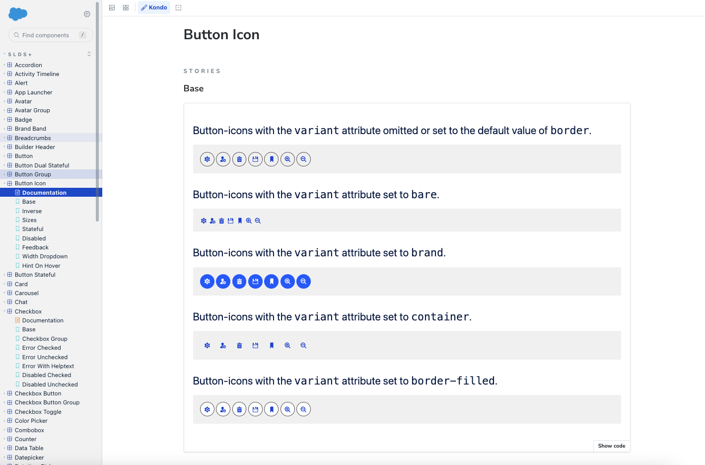
Storybook Collaboration: Bridging Design & Engineering
To maintain consistency between design and code, we worked closely with engineers to build out our components in Storybook, ensuring:
- Components behaved as designed across different use cases
- Patterns were documented for engineering alignment
- The system remained scalable and easy to maintain

The New Salesforce: Modern, Accessible, & Cohesive
🌈 Vibrant, accessible color palette – Introduced an electric blue to strengthen brand identity
📏 Skeuomorphic depth – Adds tactility for a richer, more interactive experience
🔡 Native fonts – Enhances legibility across Mac & PC for better accessibility
🌀 Rounded components – Inspired by our Salesforce cloud logo, reinforcing trust & consistency
These updates directly address branding limitations, accessibility gaps, and system inefficiencies, ensuring a modern, flexible UI that meets user and business needs.


Let’s Connect! 🤝
Want to dive deeper into this project, our post-research findings, and what’s next? Let’s set up some time to chat!


